The Whole Cat and Kaboodle
Redesigning a local cat shelter website to make it easier to adopt cats, explore services, and engage with the community.
For this case study, I used heuristic evaluation, accessibility checks, and UX design principles to identify key pain points and create a high-fidelity prototype that’s intuitive, trustworthy, and visually engaging.
Process Overview
Project Overview
This project focused on evaluating and redesigning a local cat shelter’s website to improve clarity, trust, and community engagement.
The goal is to create a more structured, emotionally engaging, and accessible digital experience that:
Clarifies and streamlines the adoption process
Increases the visibility of services, events and resources
Builds trust and emotional connection through thoughtful information architecture and storytelling
Improve mobile responsiveness and accessibility
Duration: 3 months
Tools: Figma, UX Pilot
My Role
Research
Heuristic evaluation and accessibility review
Conducted user interviews
Insight synthesis
Strategy
Defined design direction
Restructure information architecture
Design
Created low and high fidelity prototypes in Figma
Problem Statement
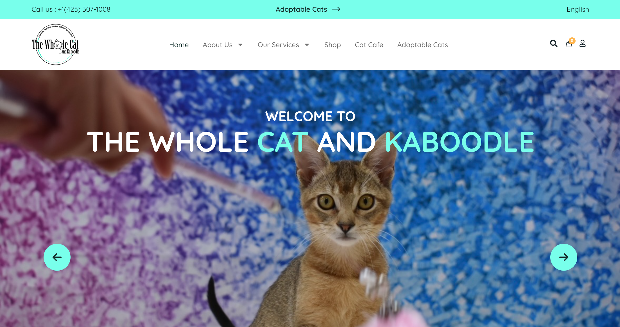
The Whole Cat and Kaboodle is a local cat shelter and boutique located in Kirkland, WA. While the organization provides personalized adoption services, its current website does not clearly communicate the process or any additional services.
Prospective adopters often face difficulty in understanding how adoption works, locating key information, and exploring ways to engage beyond browsing cats. This lack of clarity can create uncertainty and friction during an already emotional decision-making process.
Overall, the website doesn’t fully support the shelter’s goal of increasing adoptions, building trust, and encouraging ongoing involvement.
How might we create a clearer, more supportive digital experience that reduces adoption uncertainty and encourages community engagement?
Research Goals
Before conducting user interviews, I spent time to identify key assumptions and knowledge gaps to guide the research direction.
The study aimed to:
Understand user’s primary goals when visiting the site (adoption vs. other services)
Identify navigation challenges and areas of friction in discoverability
Explore how users evaluate adoptable cats and what information builds trust.
Uncover any opportunities to better support the adoption process and promote additional services.
UX Audit
Before conducting the user research, I conducted a heuristic evaluation to identify usability barriers that could be addressed independently of user feedback. This allowed me to quickly surface structural and interaction-level issues that might be contributing to friction in the adoption journey.
This step helped me form clearer research priorities, and also avoid asking users questions about issues that were already evident.
Key Findings
1) Navigation & Discoverability Gaps
Users lack clear pathways to explore and complete tasks.
There is no search or filtering for adoptable cats.
No breadcrumbs or clear “back” option on cat profiles.
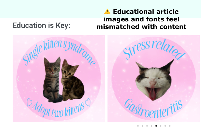
Educational articles are difficult to browse and not categorized.
Section headers behave inconsistently.
2) Inconsistent UI & Interaction Patterns
Visual and interaction inconsistencies reduce clarity and trust.
Inconsistent typography hierarchy
Varying button styles and labels (“Call Now,” “Call for Questions”)
Underlined text that is not clickable, and clickable text that is not styled as links
Carousel advances one item at a time instead of a full set
Mixed font usage across the page
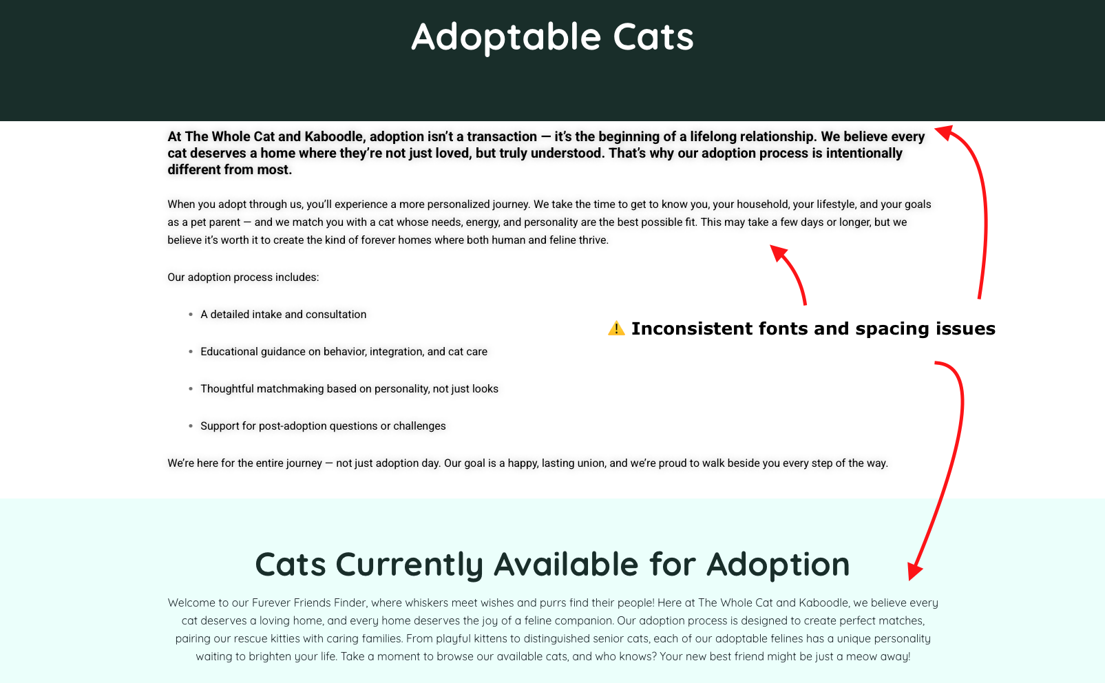
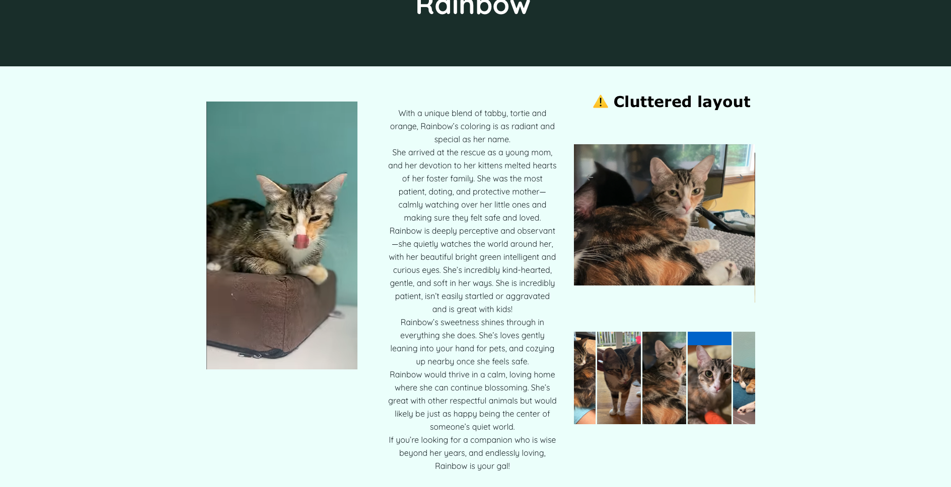
3) Visual Clutter & Readability Issues
Design choices reduce the readability and makes key actions less prominent.
Oversized images disrupt layout balance
Dense cat profiles with weak information hierarchy
Inconsistent spacing and margins
Educational content aesthetic doesn’t match informational tone
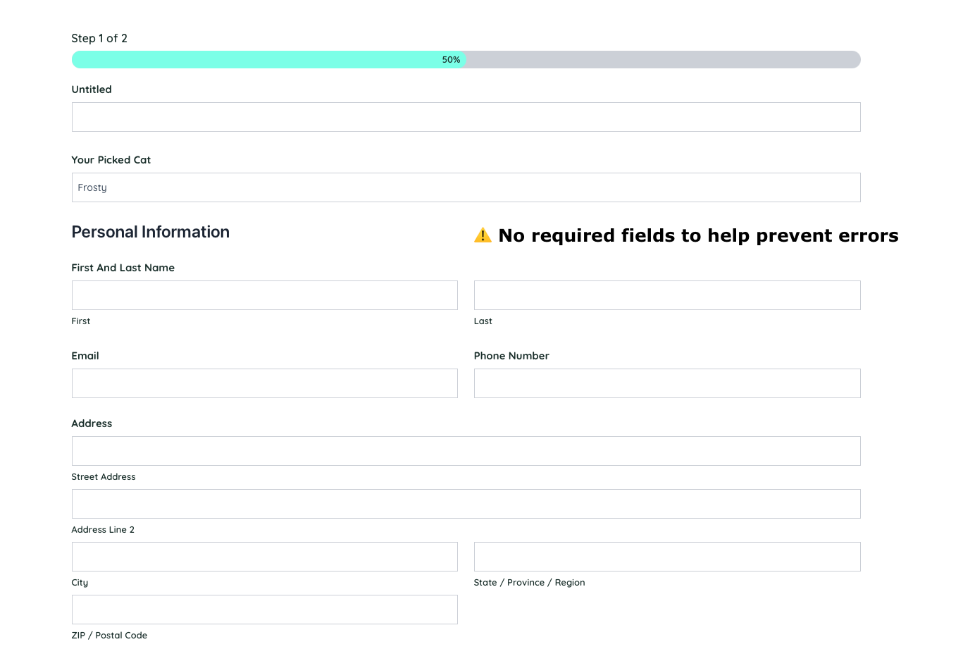
4) Form & Error Handling Weaknesses
Critical flows lack sufficient validation and feedback.
Adoption form allows incomplete submissions
No clear error messaging on required fields
Limited guidance during key decision points
Impact: Incomplete applications may slow adoption processing and frustrate users.
5) Limited flexibility and online support
The website does not fully support independent, online task completion.
Most services require phone calls instead of online booking
No saved history or support for returning users
Limited browsing controls for educational content
Impact: Reduces convenience and may discourage engagement, especially for busy or younger users.
Accessibility Review
Ensuring the site is accessible is critical for users with visual, motor, or cognitive differences and also supports overall usability and trust. I conducted an initial evaluation using Accessibility Insights for Web and supplemented it with manual testing, including keyboard navigation and visual contrast checks.
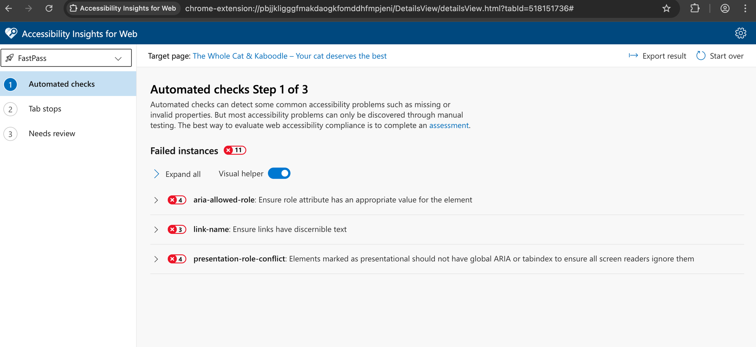
⚠️ Issues / Opportunities
Responsiveness — The site is not very mobile-friendly, making it difficult for users on smaller screens to navigate or interact with content.
Form accessibility — Required fields on the adoption application form are not clearly indicated, which can lead to incomplete submissions.
Contrast and readability — Some text has insufficient contrast against the background, making it hard to read for users with low vision.
Keyboard accessibility — Top navigation, many buttons, and interactive elements cannot be accessed via keyboard. Focus indicators are missing, making it hard for keyboard-only users to know where they are on the page.
User Research
To validate assumptions and better understand user needs, I conducted semi-structured interviews with 3 participants (pet owners, non-pet owners, and dog adopters) for 30–45 minutes each. These conversations helped me uncover gaps in my understanding, as well as confirm or challenge the goals and pain points I had identified earlier.
Adoption experience and decision-making
Website navigation and usability
Pain points in finding information or engaging with services
Research Focus 🎯

Key Findings
🛑 Trust & Credibility
The website overall feels incomplete and unprofessional, with dead links and a juvenile design that lowers trust.
“This site doesn’t feel trustworthy.”
🐱 Adoptable Cat Information
Profiles lack critical details like behavior, health, and personality, making it hard to make adoption decisions.
“I’d like to know if the cat has health issues or behavioral problems.”
🔄 Usability & Navigation
Important information is hard to find. Adoption steps are unclear and the layout feels cluttered.
“It was clunky — I found what I needed but not smoothly.”
Takeaway
These insights reinforced the need for a more trustworthy, user-friendly website that clearly communicates the adoption process and provides comprehensive cat profiles. While some users were more experienced with animal shelters than others, all agreed that the website lacked transparency and was difficult to use.
This feedback helped inform me on the direction of redesigning the navigation, content hierarchy, and visual presentation.
User Personas
To guide the redesign, I developed two key user personas based on research insights. These personas helped focus design decisions on real user goals and pain points.
Melissa - Thoughtful Adopter
📍 Seattle, WA • 22 years old • Designer
Goals: Find a cat that fits her lifestyle, understand the adoption process, and feel emotionally connected
Needs: High-quality cat profiles, clear step-by-step adoption info, easy scheduling
Pain Points: Confusing website navigation, lack of detailed cat info, unclear adoption steps

Miguel – Caring Cat Owner
📍 Kirkland, WA • 31 years old • Teacher
Goals: Find reliable grooming/boarding, book services easily
Needs: Mobile-friendly site, clear service info and pricing, online booking
Pain Points: Hard-to-find service info, no online booking, outdated contact methods
Comparative Analysis
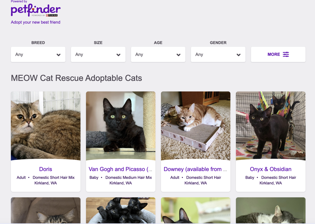
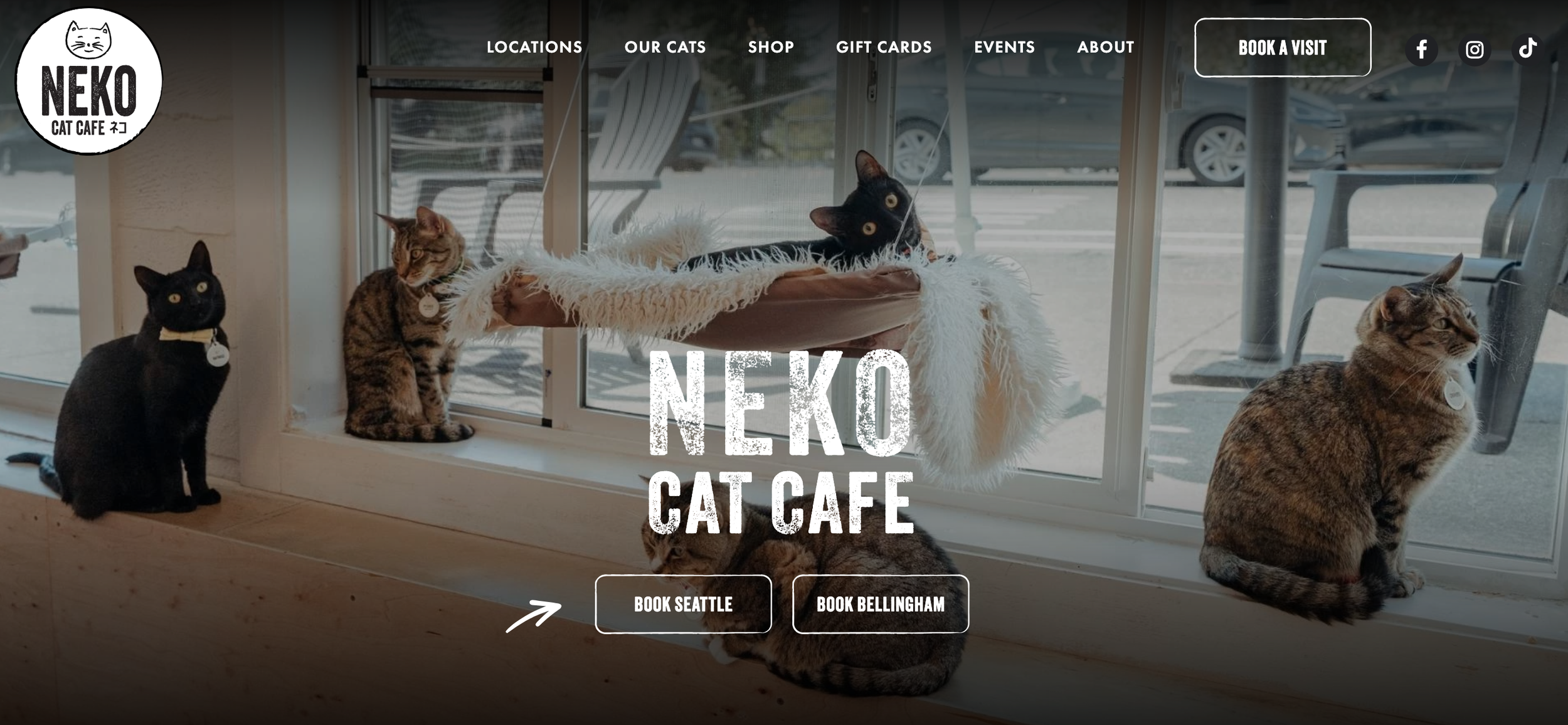
I reviewed three local shelter and cat café websites to identify best practices, usability patterns, and opportunities to improve The Whole Cat and Kaboodle’s user experience.
Key Takeaways
Transparent Adoption Process: Many other shelters have clear step-by-step instructions and upfront fees build trust and reduce uncertainty.
Filterable Cat Search: Users often benefit from easy filtering and detailed cat information for informed decisions.
Consistent, Cohesive Design: Minimalist or playful branding with uniform UI elements helps improve readability and credibility.
Community Engagement: Highlighting recently adopted cats, events, and social media activity strengthens emotional connection and ongoing involvement.
Online Services: Integrated booking and e-commerce streamline interactions and increase convenience.
Information Architecture
Understanding the site’s structure was key to improving navigation, discoverability, and the user experience. For this I audited the current website, identified gaps, and designed a new information architecture that supports primary user goals.
Sitemap
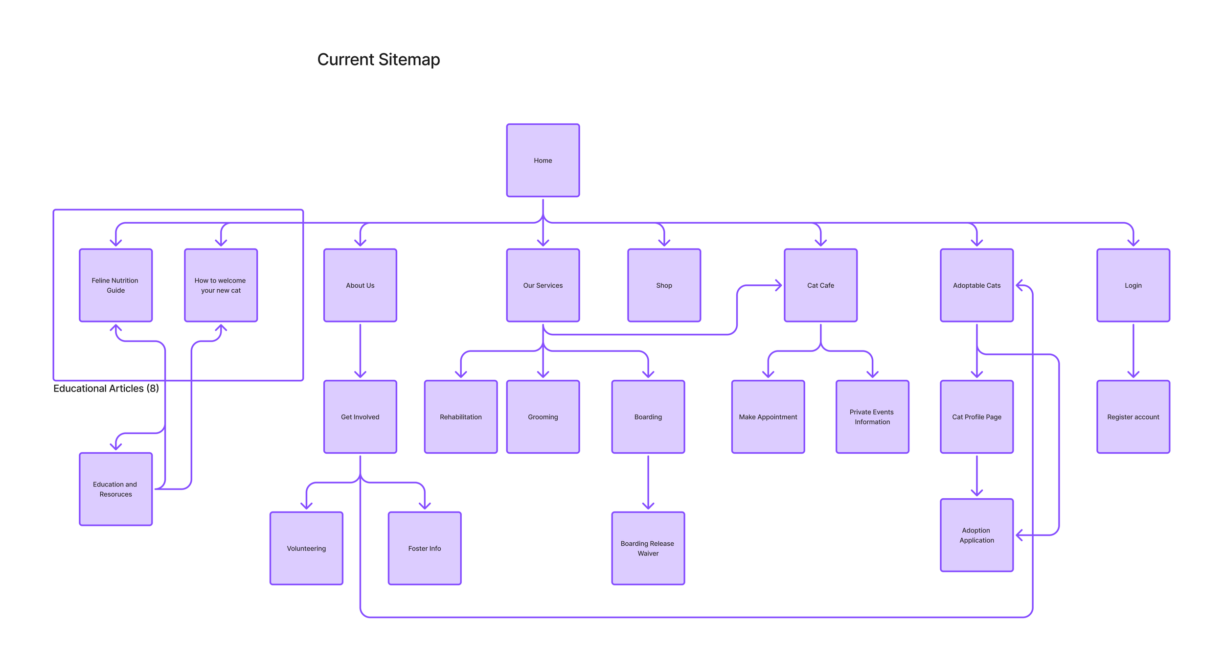
Current - The existing sitemap revealed buried content, inconsistent hierarchy, and unclear navigation.
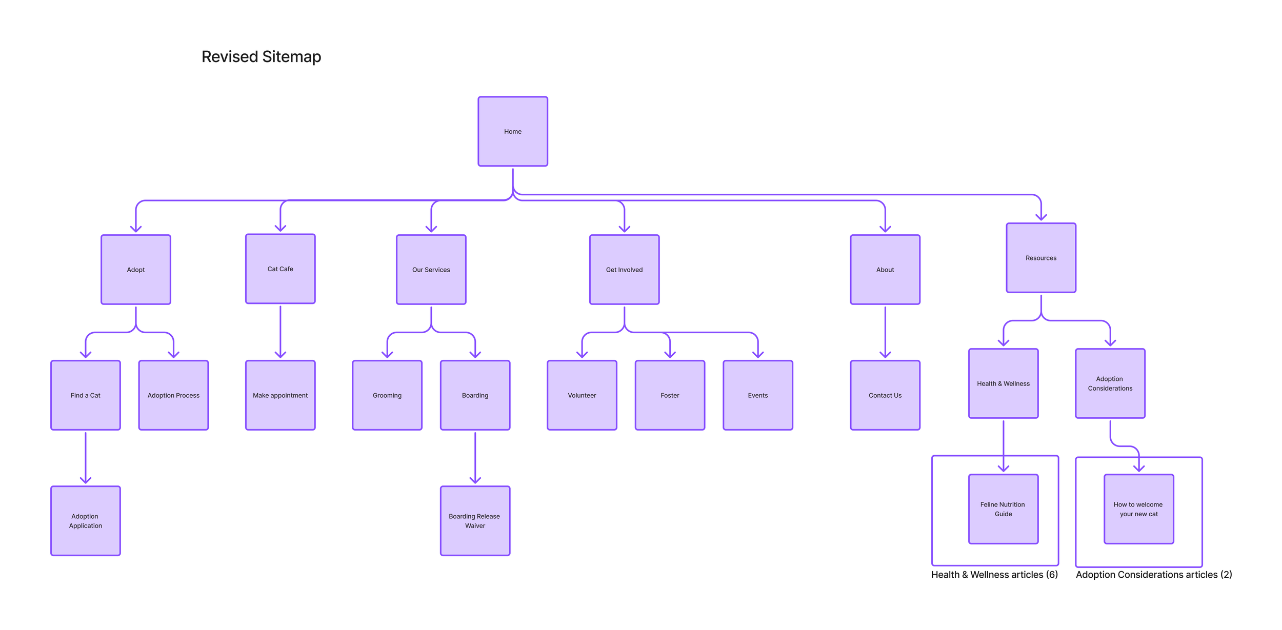
Updated - The redesigned sitemap clarifies key areas, emphasizes adoption and services, and organizes content to better support user goals.
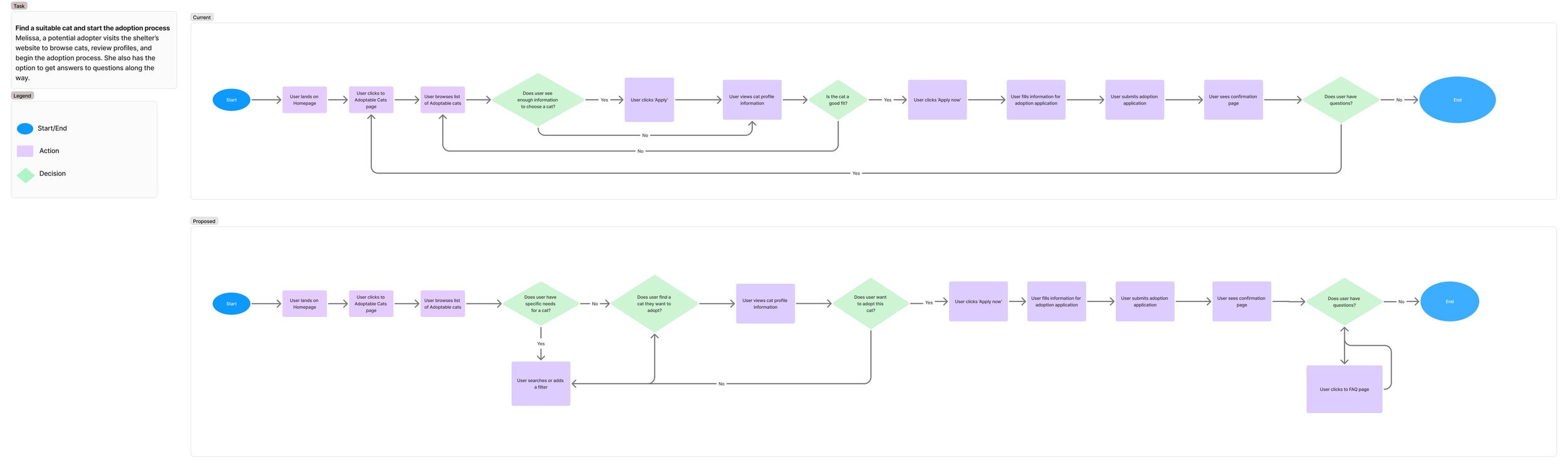
I also mapped the adoption process as it currently exists to identify usability challenges, such as unclear steps, missing cat information, and inefficient navigation.
The revised flow then addresses these issues by clarifying adoption steps, adding detailed cat profiles with filters, and guides users smoothly from exploration to application. This flow directly informed the high-fidelity prototype, ensuring an intuitive adoption experience.
User Flows
Low Fidelity Prototype
To explore layout, hierarchy, and user interactions without being distracted by visuals, I created a low-fidelity prototype. These wireframes helped test the structure of key pages and flows, especially the adoption process, before committing to high-fidelity design.
Some initial screens were generated with UX Pilot to accelerate ideation, which I then iterated on based on research insights and design goals.
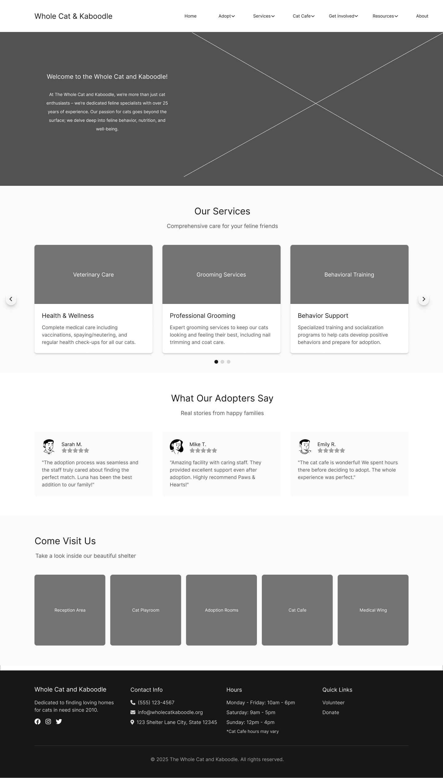
Homepage - clear services, testimonials, and improved navigation for easier exploration.
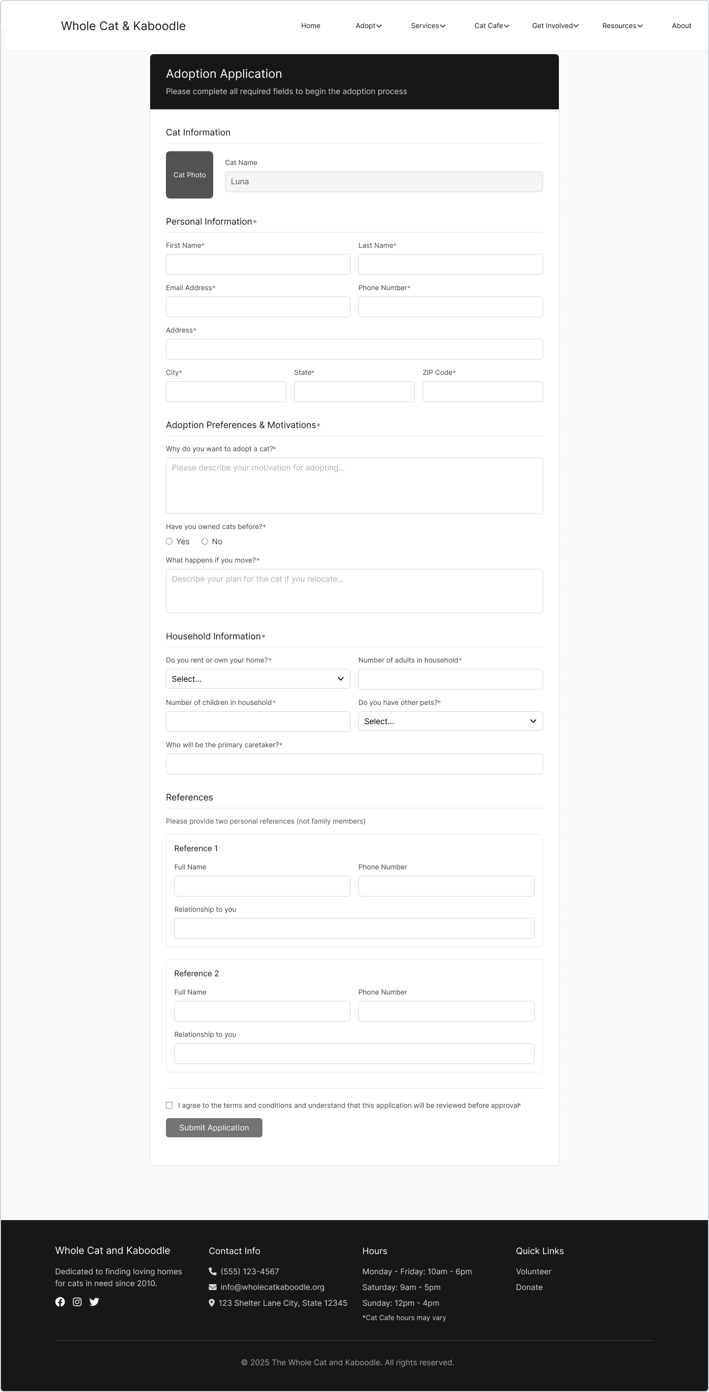
Adoption Form - Required fields and a disabled submit state prevent incomplete applications.
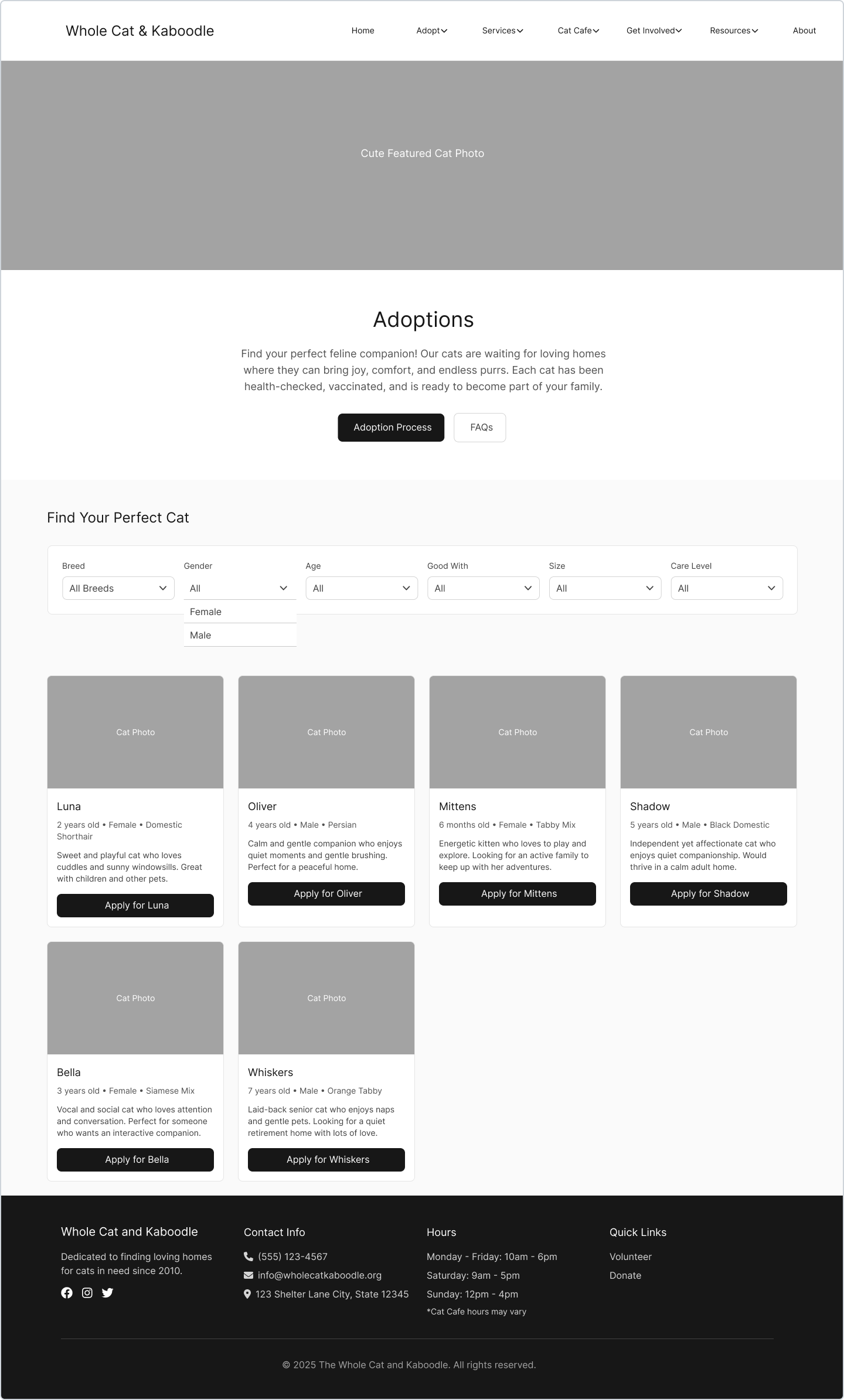
Adoptions - includes filterable cat listings with key details displayed upfront.
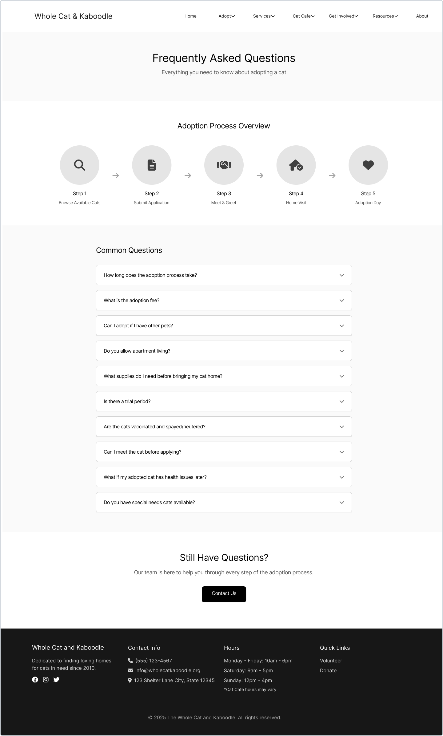
FAQ page - Dedicated FAQs build trust and clarify the adoption process.
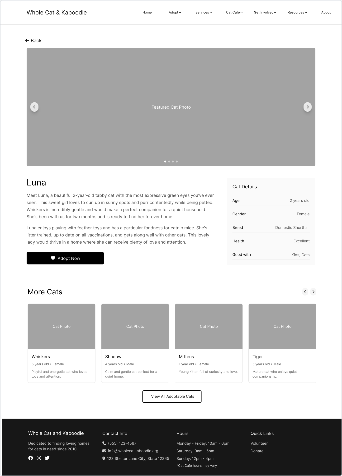
Cat profile - a larger photo carousel, essential info card, and clearer navigation.
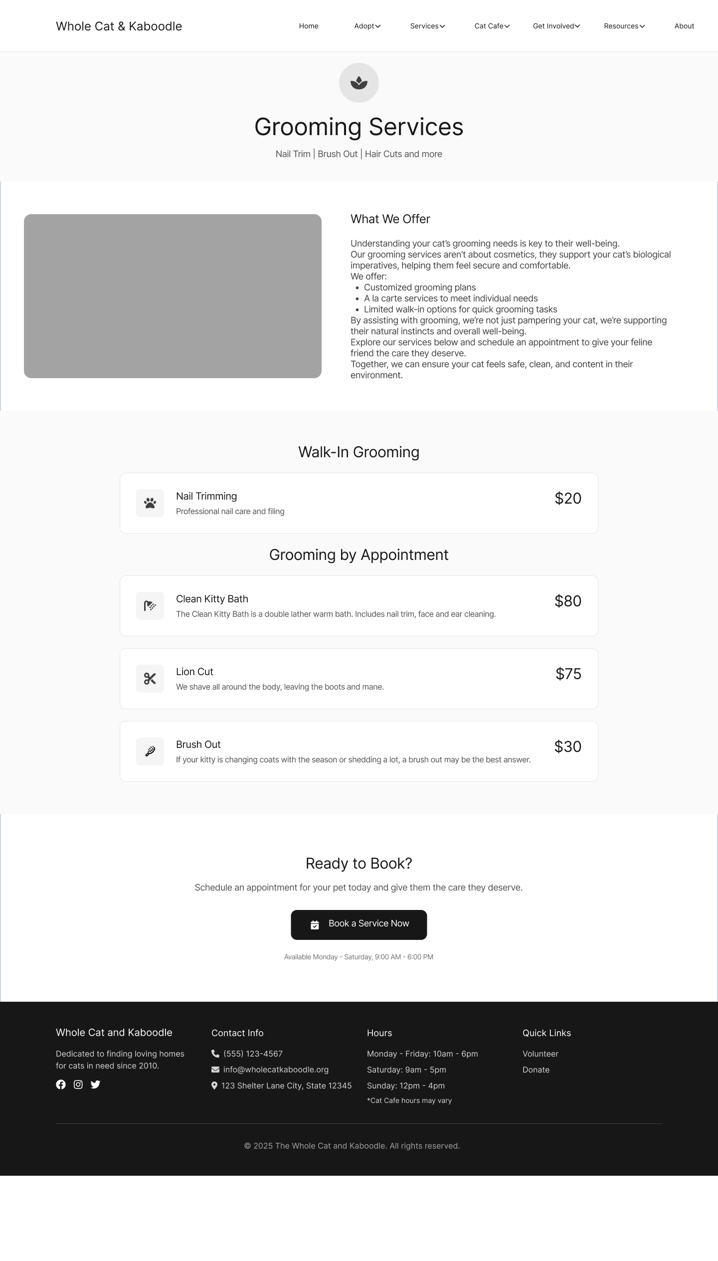
Grooming - clear services, transparent pricing, and a strong booking CTA.
Visual Design & System
After validating the structure through low-fidelity wireframes, I shifted focus to visual direction and system consistency. Here I explored brand alignment, defined typography and color styles, and built a scalable design system before moving into high-fidelity screens.
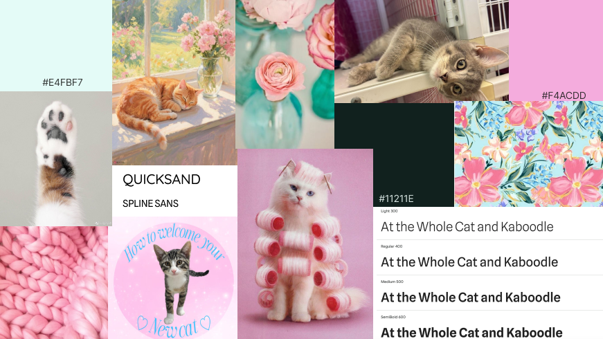
I created a mood board to define the emotional tone of the redesign while drawing inspiration from the existing color scheme. The visual direction balances warmth and playfulness with clarity and trust, reinforcing the shelter’s community feel while elevating its professionalism.
Mood Board & Visual Direction
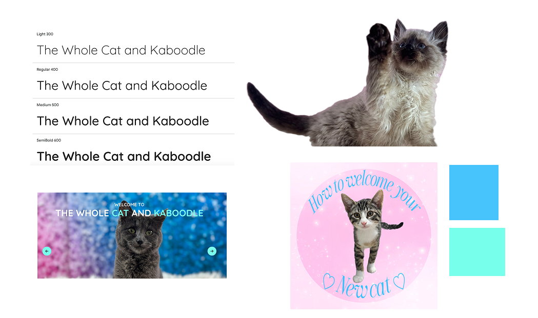
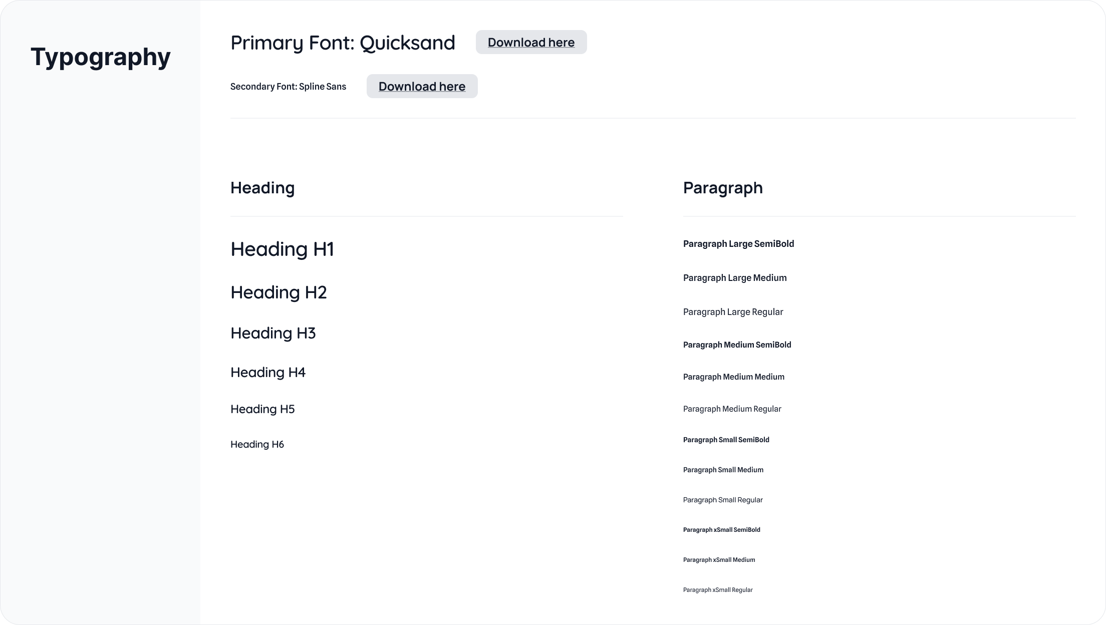
I selected fonts and colors that aligned with the existing brand while also improving contrast and accessibility. A new secondary font was chosen for readability, while the primary font continues to supports emotional content.
Typography & Colors
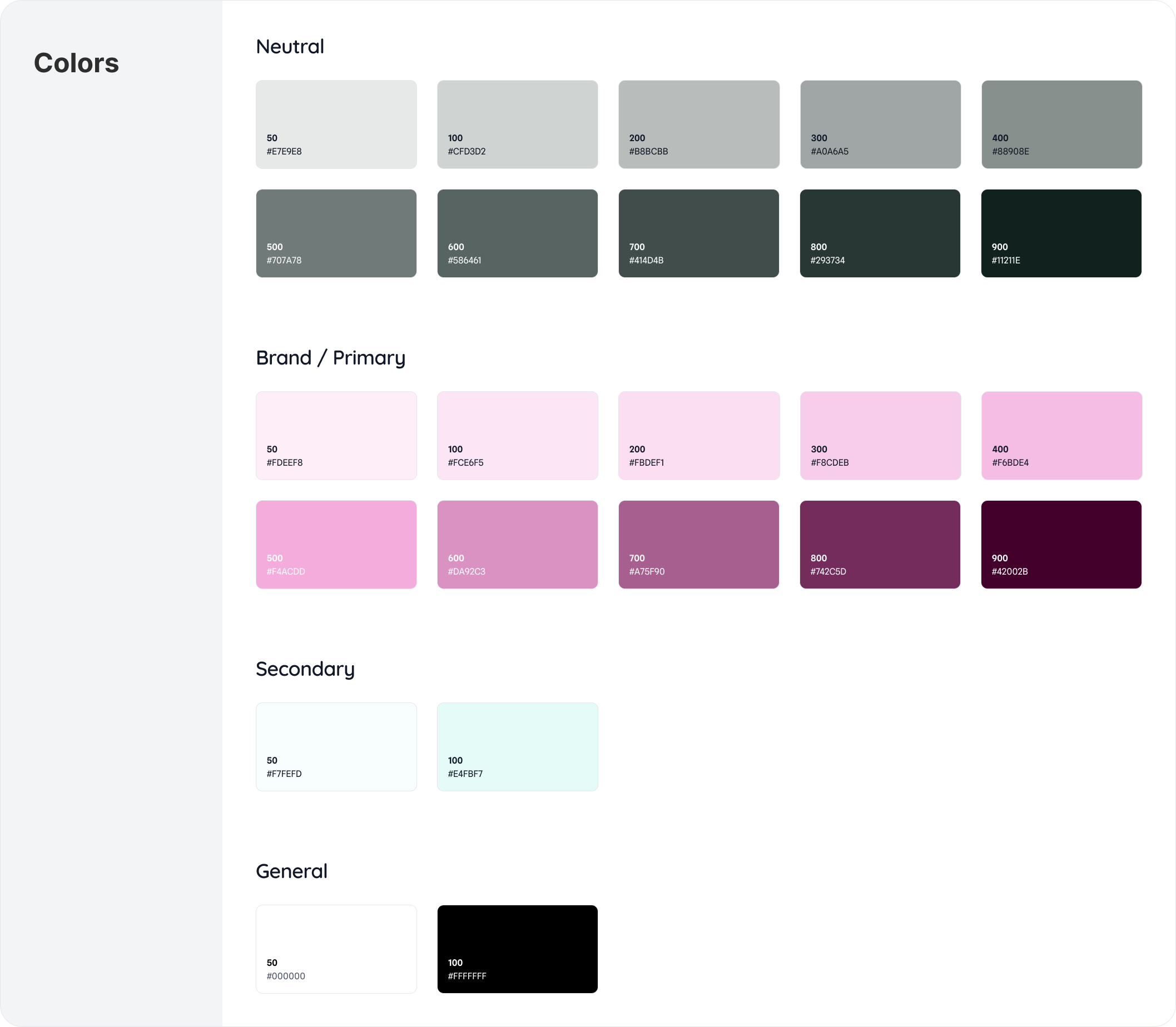
To ensure consistency, scalability, and efficient implementation, I developed a lightweight design system grounded in accessibility and reusability.
Rather than designing page-by-page, I created modular components — including navigation patterns, cat profile cards, service cards, buttons, and form elements — that can be reused across the site. This approach supports long-term maintainability and makes it easier to expand content, add new services, or feature additional adoptable cats without redesigning layouts.
Design System
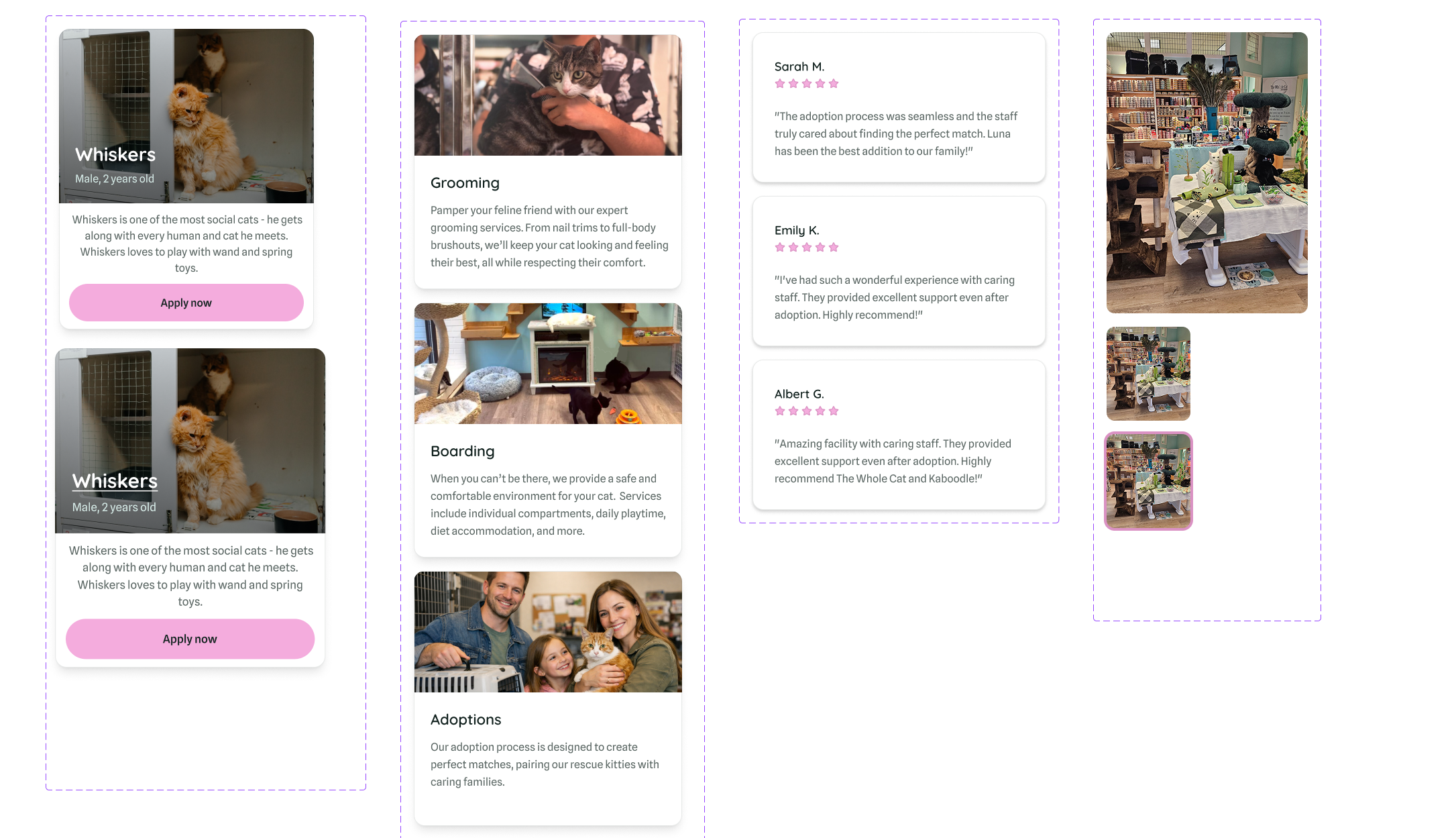
Cards that can be used for displaying adoptable cats, services, and customer testimonials.
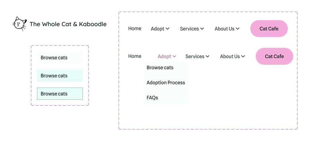
Resizable navigation menu with clearer information hierarchy.
Each component also includes defined interaction states (hover, focus, active, disabled, and error) to support accessibility and predictable user feedback. Color contrast and visual hierarchy were considered to meet accessibility standards and reduce cognitive load.
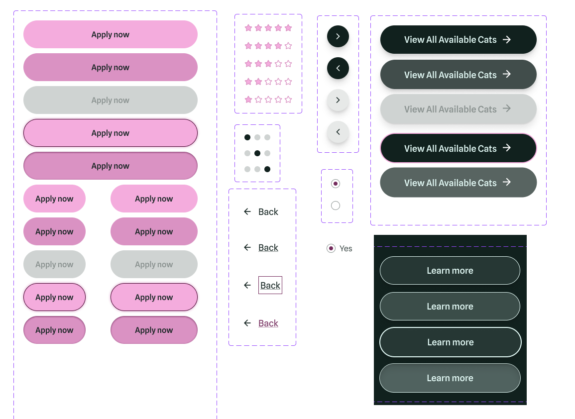
Scable and accessible buttons that support multiple interaction states.
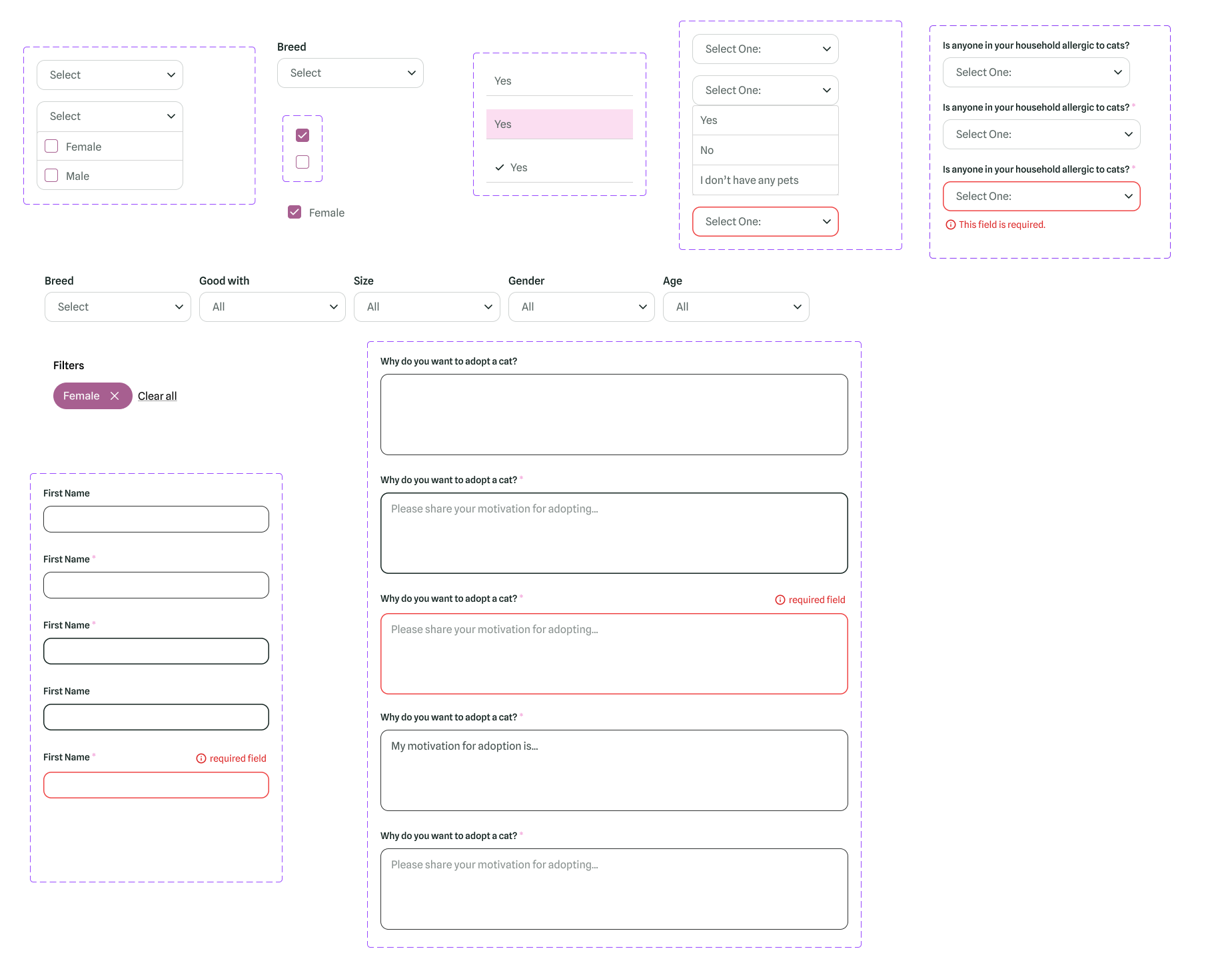
Required form inputs that handle focus, active, and also error states.
By thinking from a front-end engineering perspective while developing these components, the result is a design that balances warmth with structural clarity — creating an experience that is cohesive, scalable, and implementation-ready.
High Fidelity Prototype
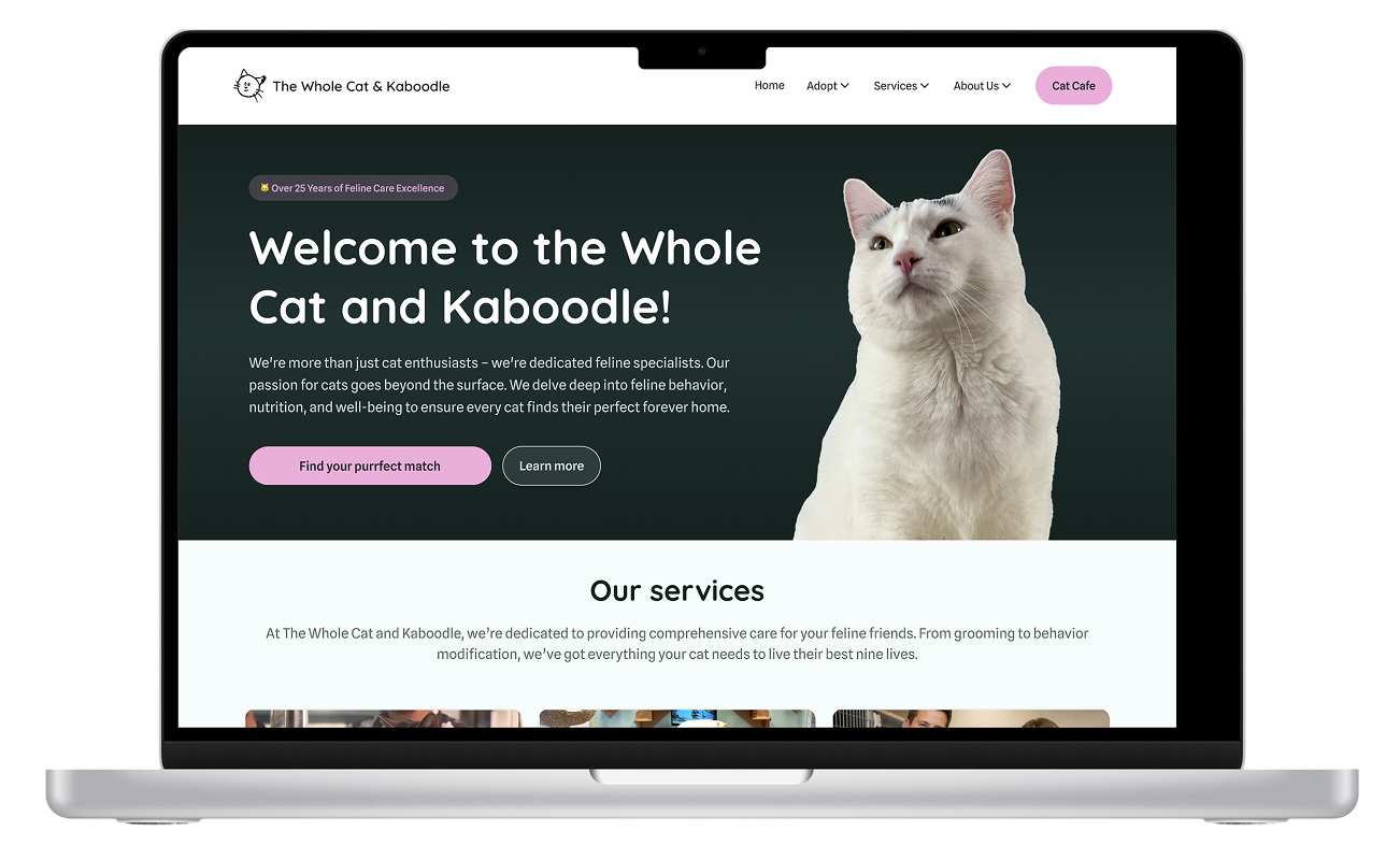
After finalizing the design system and building out the key components, I created a high-fidelity prototype to bring the Whole Cat and Kaboodle website to life. The prototype focuses on improving adoption flows, highlighting adoptable cats, and making the site more user-friendly and visually engaging.
Homepage pt.1 - Clean, modern layout with key services highlighted in a carousel for easy browsing.
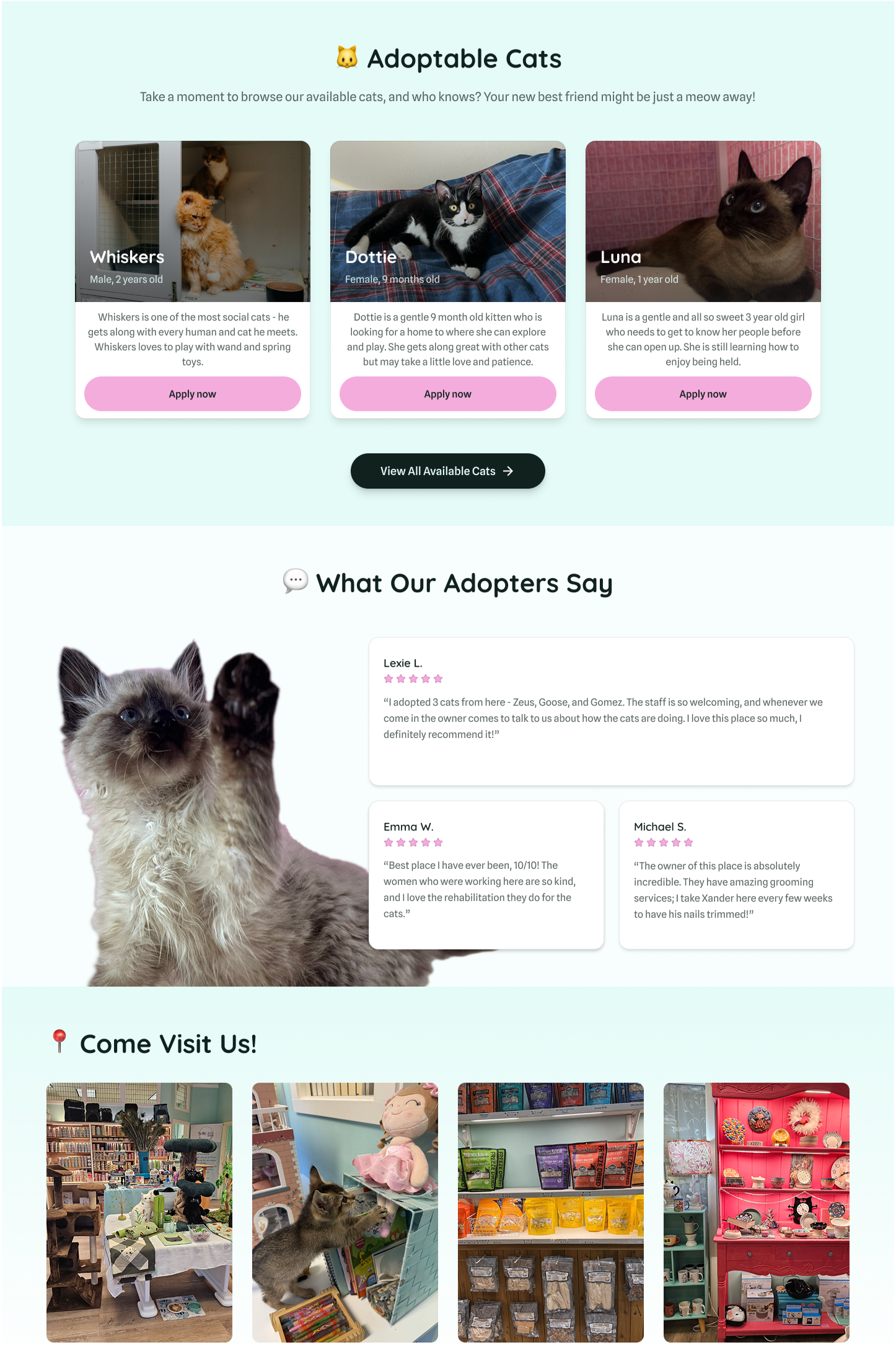
Homepage pt.2 - Featured adoptable cats section shows a clear call-to-action to view more, and testimonials help build trust.
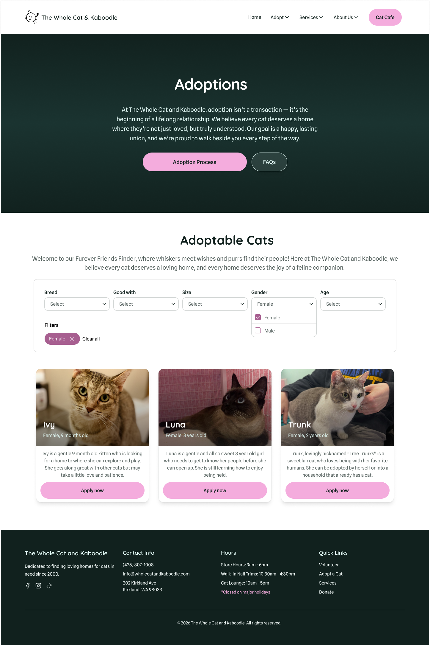
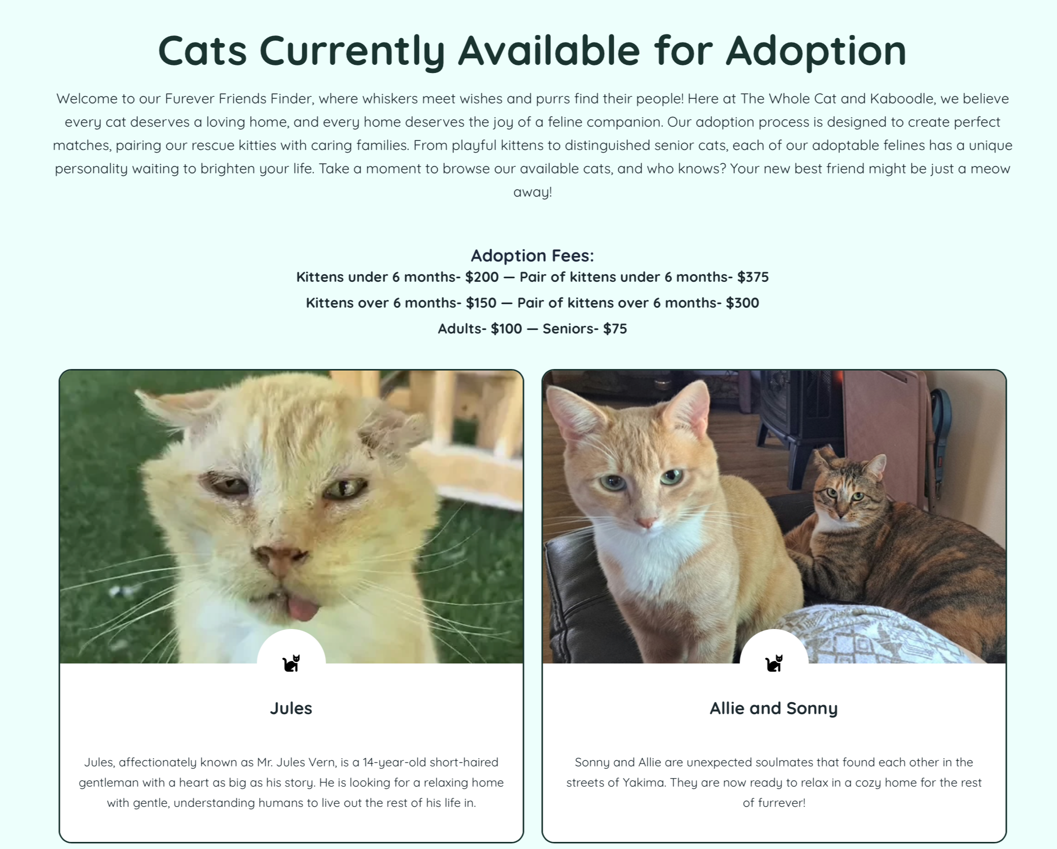
Adoptions page - Users can quickly filter cats by preferences, and each card displays essential for easier decision-making.
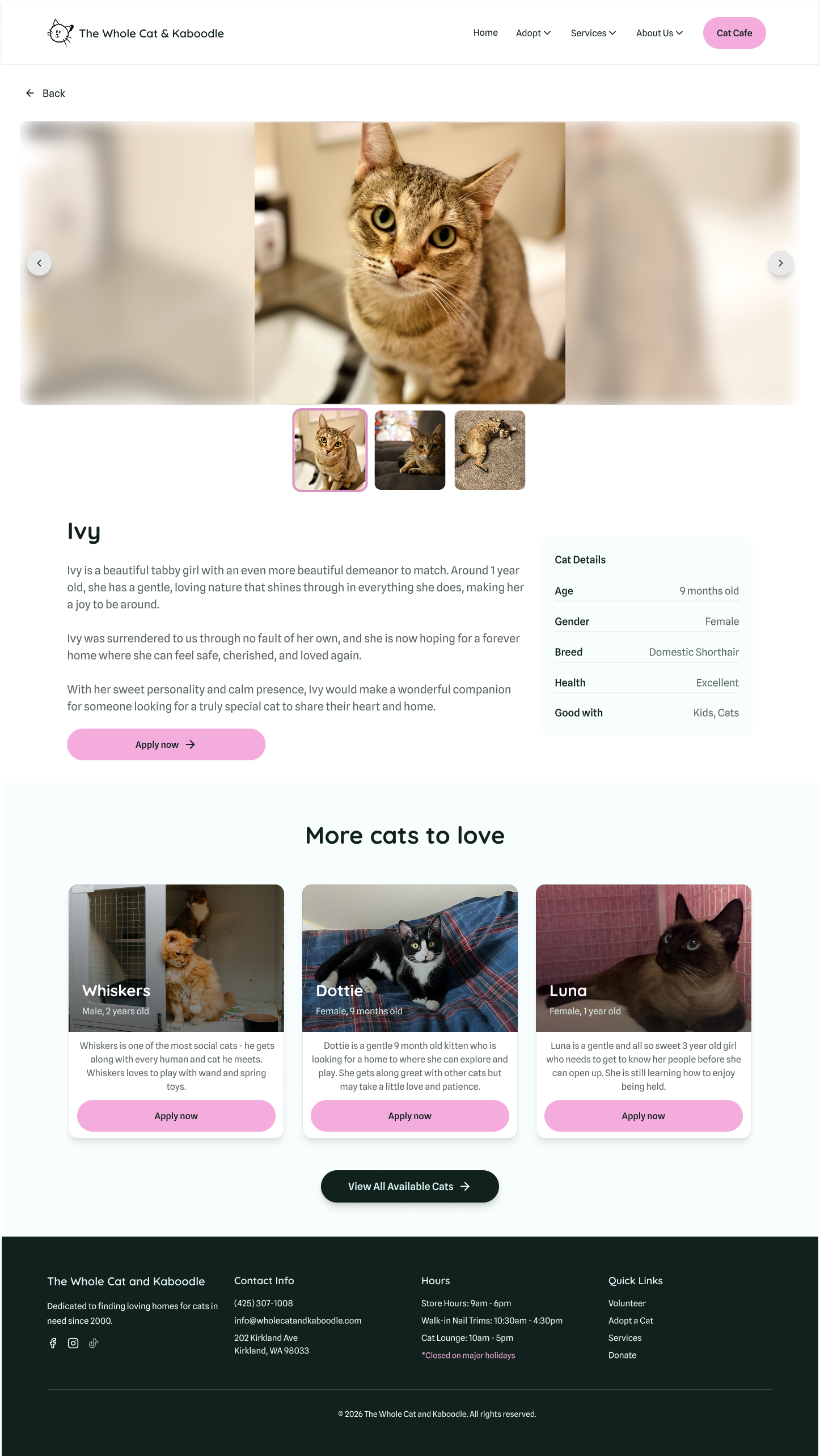
Cat profile page - Wide photo carousel and key cat details clearly displayed, with a prominent call-to-action to Adopt.
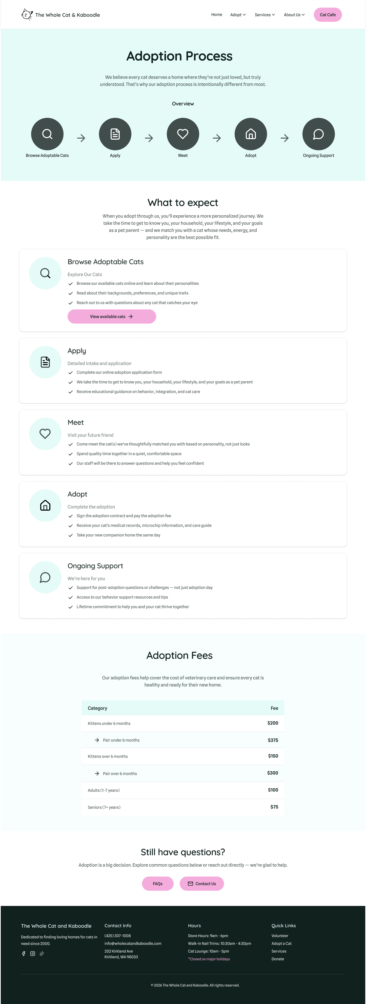
Adoption Process page pt. 1 - Step-by-step diagram outlines the adoption journey, with detailed explanations for each stage below.
Adoption Process page pt. 2 - Clear, easy-to-read table displaying fees for kittens, adults, and seniors, helps users understand costs at a glance.